Fixing Alignment Issues on Websites: Theory, Best Practices, and Practical Solutions
Fixing Alignment Issues on Websites: Theory, Best Practices, and Practical Solutions
When it comes to website design, alignment issues can be a source of frustration and a barrier to a seamless user experience. From misaligned text and images to inconsistent layouts, these problems can detract from the professionalism and functionality of your site. In this blog post, we'll delve into the theory and best practices for fixing alignment issues, offering insights beyond the step-by-step process outlined in our comprehensive guide.

Why Alignment Matters in Web Design
Alignment is a fundamental aspect of web design that ensures visual consistency and improves user experience. It involves arranging elements in a way that creates a cohesive and aesthetically pleasing layout. Here's why alignment matters:
Enhances Readability: Proper alignment improves the readability of text and content, making it easier for users to engage with your site.
Creates Visual Harmony: Aligning elements creates a balanced and organized appearance, enhancing the overall design.
Improves Navigation: Consistent alignment guides users through the site, making navigation intuitive and straightforward.
Boosts Credibility: A well-aligned site conveys professionalism and attention to detail, building trust with your audience.
For businesses looking to optimize their digital presence, Ad Ronin offers web design solutions that prioritize alignment and user experience.
Key Principles of Alignment in Web Design
Understanding the principles of alignment can help you create a more visually appealing and functional website. Here are the key principles to consider:
1. Consistent Alignment
Consistency is key to effective alignment. Ensuring that elements align uniformly across the site creates a harmonious and professional appearance. Here are some tips for maintaining consistent alignment:
Use a Grid System: Implementing a grid system helps align elements consistently, providing a structured layout.
Standardize Margins and Padding: Consistent margins and padding ensure that elements have uniform spacing, preventing a cluttered appearance.
Align Text and Images: Ensure that text and images align with each other, creating a cohesive visual flow.
For a detailed guide on maintaining consistent alignment, refer to our step-by-step process.

2. Vertical and Horizontal Alignment
Proper alignment involves both vertical and horizontal positioning of elements. Here’s how to achieve balanced alignment:
Vertical Alignment: Ensure that elements align vertically, creating a clear hierarchy and flow. Use tools like CSS Flexbox or Grid for precise vertical alignment.
Horizontal Alignment: Align elements horizontally to create symmetry and balance. This can be achieved using CSS properties such as
text-align,margin, andpadding.Align with Purpose: Consider the purpose of each element and align them to enhance user interaction and engagement.
A well-aligned layout not only looks appealing, but also improves user interaction and engagement.
3. Responsive Alignment
With the growing use of mobile devices, responsive design is essential. Here’s how to ensure alignment remains consistent across all devices:
Use Responsive Design Techniques: Implement responsive design techniques like media queries to adjust alignment based on screen size.
Test on Multiple Devices: Regularly test your site on different devices to ensure alignment remains consistent and user-friendly.
Prioritize Mobile Alignment: Given the prevalence of mobile users, prioritize mobile alignment to provide a seamless experience across all devices.
For more information on responsive design, explore our digital marketing blog.
Practical Example: Fixing Alignment Issues
Let’s explore a practical example of how to address alignment issues effectively:
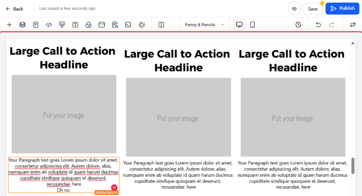
Imagine you manage a blog site that features articles and images. However, you've noticed that the text and images are misaligned, leading to a disorganized appearance. Here’s how to fix it:
Identify Misaligned Elements: Use tools like browser developer tools to identify elements that are misaligned.
Adjust CSS Styles: Modify CSS styles to align text and images consistently. Use properties like
display: flex;for flexible alignment.Implement a Grid System: Apply a grid system to structure your layout, ensuring consistent spacing and alignment.
Test Across Devices: Test the site on various devices to ensure responsive alignment.
By following these steps, you can improve the visual appeal and functionality of your site, enhancing the user experience.
For a detailed guide on fixing alignment issues, refer to our workflow.
Conclusion: Achieve Perfect Alignment with Ad Ronin
Alignment is a critical component of web design that impacts user experience, aesthetics, and credibility. By understanding the principles and best practices of alignment, you can create a visually appealing and functional website that resonates with your audience.
At Ad Ronin, we offer comprehensive web design and digital marketing services to help you achieve perfect alignment and elevate your online presence. Contact us today to learn more about how we can support your digital goals.
For further insights and a step-by-step guide on fixing alignment issues, check out our comprehensive workflow.

